Christina Xu has long been interested in accessible design. As the product manager for the Accessibility (A11y) team at real-time collaboration software company Quip, it's more than just a passing fascination—it's a key part of her job.
Because Quip makes collaboration tools that are designed to empower people to work effectively together, says Christina, it's vital that those tools are designed to be used by everyone. "If an employee can't use our tools, it affects their ability to do their jobs, to get updates, respond to coworkers, participate in projects, or share their ideas," says Christina.
"I'm constantly thinking about who technology empowers, who it disables, and who gets to make those decisions," she adds, sharing that accessibility became even more important to her when her partner was diagnosed with a chronic illness. "Basic computer interactions like sitting at a desktop and using a mouse, or tapping text messages out on a phone, [can be] very painful [for them]. Watching them explore different tools and assistive technologies to make those experiences a little easier is a constant reminder of the importance of this work."
Christina's team has worked on several accessibility projects over the last few months, including Dark/High Contrast mode, designed for low-vision users and also a popular feature in general. We interviewed Christina along with three product engineers she works with—Tommy Vo, Joyce Zhu, and Ben Cronin—about their experience on that project and what they've learned about accessible product design and engineering.
Impactful work that's intellectually challenging
Ben has a very close friend, Laura, who has been blind for most of her life. "Her story has really shaped my understanding of what it means for someone to be 'disabled,'" he explains. "The fact that she cannot see may profoundly change the way she experiences the world, but it does not make her incapable of participating in and contributing to it." Working on accessibility projects makes Ben feel like he's creating a more even playing field for people like Laura.
But Ben's not in this work just for that rewarding feeling (though he does enjoy it). He also finds engineering for accessibility an intellectually stimulating problem. "I like the challenge of developing different frameworks for conveying all the information and enabling all the functionality that someone needs to successfully interact with a complex app," he says.
Tommy, who has worked on A11y features at Quip for other projects like their Navigation Redesign and Message Composer, agrees: "Accessibility teaches me to tackle problems logically and helps me learn new things about the web and assistive technology every day," he says. "For example, nothing grinds my gears more than discovering different behavior of HTML elements across browsers, yet I love learning about caveats like that and could spend hours researching in my own time."
Tommy also likes how clear-cut the wins are in accessible design. "Versus other UX projects where it might be hard to define success, it is often easy for me to tell whether an accessibility feature is satisfactory or not," he says. "Can our customers use it? Does it pass the defined ARIA standard or not?"
Joyce is a big personal fan of Dark/High Contrast mode and long wished she could use it on the products she works on every day. "When we had enough engineers to staff a full-time accessibility team, I was eager to do a technical investigation into how to create robust dark and high-contrast themes," she says.
Christina maps out the steps towards making Dark/High Contrast mode a reality, highlighting the complex engineering and design problems that had to be carefully solved before bringing the much-requested feature to life:
- "Tommy had to implement semantic colors for all of Quip. This means that instead of designers specifying that a button is a certain shade of blue in the code, they would instead specify that a button is 'button-colored,' and we would then render a precise color based on whether Quip was in Light, Dark, or High Contrast mode.
- Then, our designers came up with a formula to translate colors into these two modes.
- After that, it took many eyes and a long time to painstakingly identify all the edge cases where that translation didn't look quite right and adjust it, sometimes with the help of other teams at Quip."
Ben highlights how accessibility best practices are well-aligned with engineering best practices. "Small, time-consuming changes tend to be more effective than large, quick ones. In that vein, one of the most satisfying (if least technically impressive) changes I worked on was making a few minor tweaks to the ARIA markup for the main navigation structure of Quip; from what I've heard, just those small changes made it much easier for screen reader users to understand the general layout of the app," he says.
Making accessibility a priority
When we interviewed the A11y team at Quip, we asked them what they wished other PMs, designers, and engineers knew about the importance of designing with accessibility in mind. They gave lots of great tips, and we've rounded those up in the next section for you. But there was one major takeaway that each of them kept coming back to: how vital it is that accessibility is part of a product roadmap from the very beginning.
"Always plan ahead when it comes to design with accessibility in mind, even before coding," says Tommy. "It usually reveals a pattern or behavior of your product that is easily overlooked and could be costly to address if realized later on."
"Accessible design and engineering is actually best and easiest when done at the beginning of the feature implementation process, instead of being bolted on as an additional launch readiness checklist item," agrees Joyce.
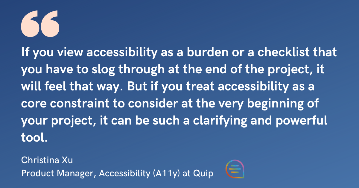
Try to see a focus on accessibility as an opportunity, says Christina. "If you view accessibility as a burden or a checklist that you have to slog through at the end of the project, it will feel that way. But if you treat accessibility as a core constraint to consider at the very beginning of your project, it can be such a clarifying and powerful tool," she says.
6 ways to make your product design more accessible
1. Make no assumptions.
"If a design assumes that someone is able to process information visually on different parts of the page at the same time, or that they can precisely maneuver a mouse cursor, there's a pretty good chance that most users will have a suboptimal experience," says Ben.
2. Try it out yourself.
Joyce suggests that other engineers try navigating their products the way that users with different impairments might in order to get a small taste of what they're solving for. "Try using only your keyboard to navigate your site, turning on one of the many browser extensions which emulate color-blind vision and trying to get around using a screenreader—no looking at your monitor! You might be surprised at what affordances you wish you were able to use."
3. Go beyond just being empathetic.
Christina learned something from her background in qualitative research that she thinks about constantly with her accessibility work: "Your own imagination is full of assumptions and biases that are almost certainly wrong."
"Our team works very closely with some wonderful accessibility consultants (Prime Access Consulting) who are blind and low-vision themselves, and their real lived experiences help check any well-intentioned but wrong instincts," she adds.
4. Create a framework for prioritizing features.
Christina asks four questions of potential accessibility projects before deciding which to start with:
- How severe is the issue for people who are impacted by it? Is it annoying, confusing/disorienting, or fully disabling?
- How widely used or fundamental is the feature or surface that the issue is occurring on?
- Is there a workaround to the issue or not?
- What size and complexity of project is my team realistically able to handle at the time?
5. Plan carefully.
This one is true for most engineering projects, but worth highlighting here. Tommy shares that he spent a full week not even coding but rather focusing on writing up a detailed roadmap as to how their team would deliver the Dark/High Contrast mode to their organization, company, and public users. "Setting up expectations early really helps me and my team understand the project's scope, making sure we're on top of things and avoiding potential crunch along the way," he says.
6. Recognize that there's a lack of documentation around accessible design best practices—and contribute to it when you can.
Ben has found that while some resources exist, nuanced conventions—"That 'aria-label' should only be used with certain types of elements, or that 'aria-disabled' works slightly differently from 'disabled' depending on the element it's applied to," he provides as an example—are hard to find. Their team has gotten around that by working with their consultants and doing a lot of trial and error, and they're working to document what they've learned. "That [way], the broader Quip team can get a better understanding of a11y do's and don't's that go beyond the specs," he says.
To learn more about Quip and their open roles, go here.
